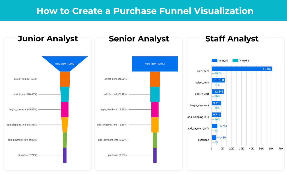

"Why do more senior analysts prefer simple bar charts for purchase funnel visualization"
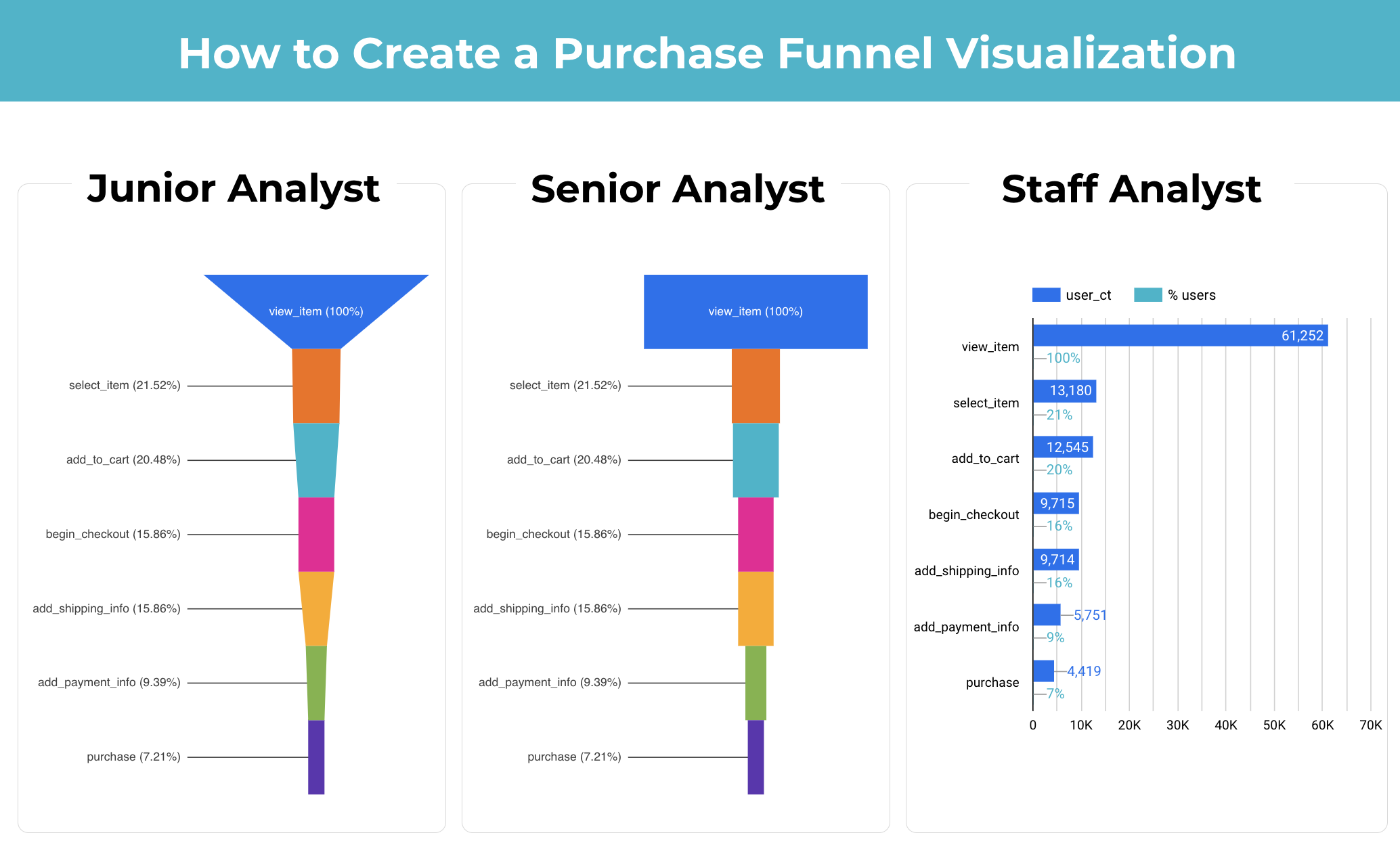
When visualizing purchase funnels, junior analysts often lean towards using funnel charts, as they look sophisticated and seem tailored for showing conversion steps. However, while they provide a nice visual overview, funnel charts can sometimes obscure key details, particularly the differences or drop-offs between steps.
Key benefits of the bar chart
- Easier comparison across steps: The bar chart used by the staff analyst in the third visualization provides clear side-by-side comparison. The drop in user counts at each stage is straightforward to interpret, which makes identifying where most users drop off simpler.
- Clarity of exact values: While the funnel chart relies on proportional representation, the bar chart offers specific values, allowing analysts to quantify the difference more accurately. Combining both user count and percentage of total users provides a dual insight that helps assess the conversion rate and user flow.
The Lesson for Analysts
While a funnel chart may look appealing, it's not always the best tool for analyzing drop-offs between each step. Opting for a simple bar chart often provides more accessible insights into where improvements are needed in the user journey.
Remember, it's not about how fancy the chart looks but about how effectively it communicates the critical insights.