Do you ever feel today’s advertisements tend to focus more on tactics vs. the ads themselves?
Without the “distractions” of technology setups, advertisements from the mad men era pay greater attention to strategies and copies, given that’s all they have to compete with. I found myself learning more by studying these older ads. So here are 15 of the most-iconic mad-men-era ads, for your inspiration.
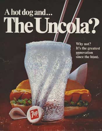
7 Up made an impression by positioning itself relative to an established brand.
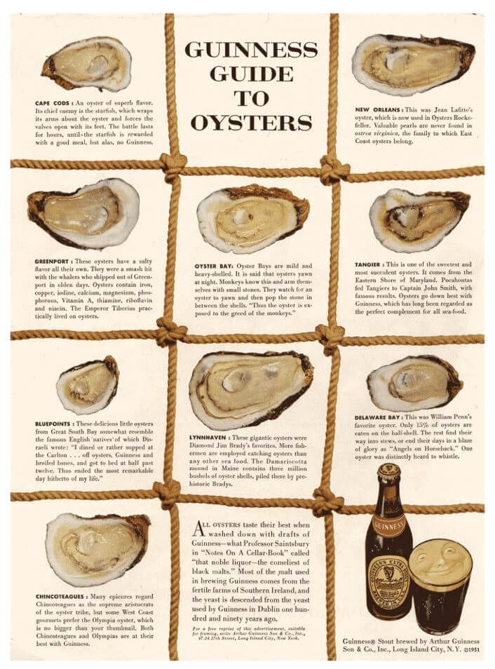
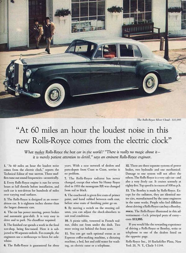
The first ad David Ogilvy wrote at his own agency. You can actually request a free reprint of this advertisement as home decor.
The headline is a statement Ogilvy came across from reading everything about the Rolls-Royce car for 3 weeks. How to produce advertising that sells? Study your products.
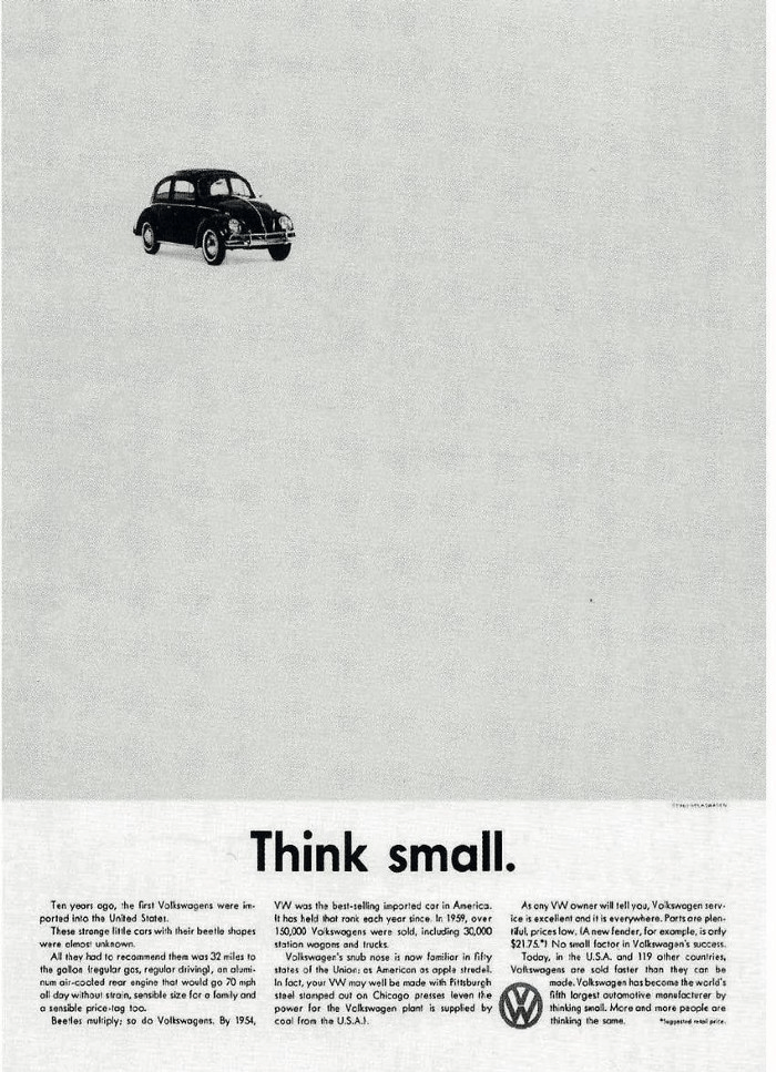
Doyle Dane Bernbach positioned Beetle as a non-conformist, something opposite to what’s commonly in prospects’ minds about cars.
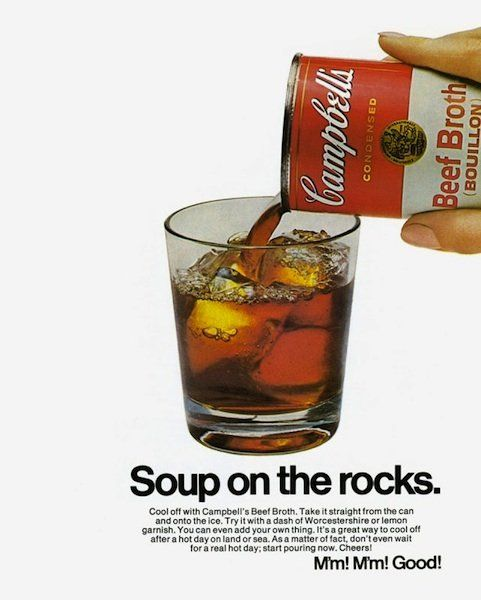
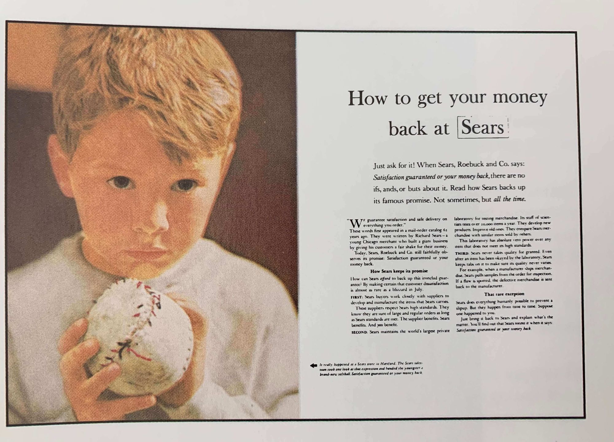
Headline with news (new products, improvement of old products, new ways of using products) makes bigger impressions.
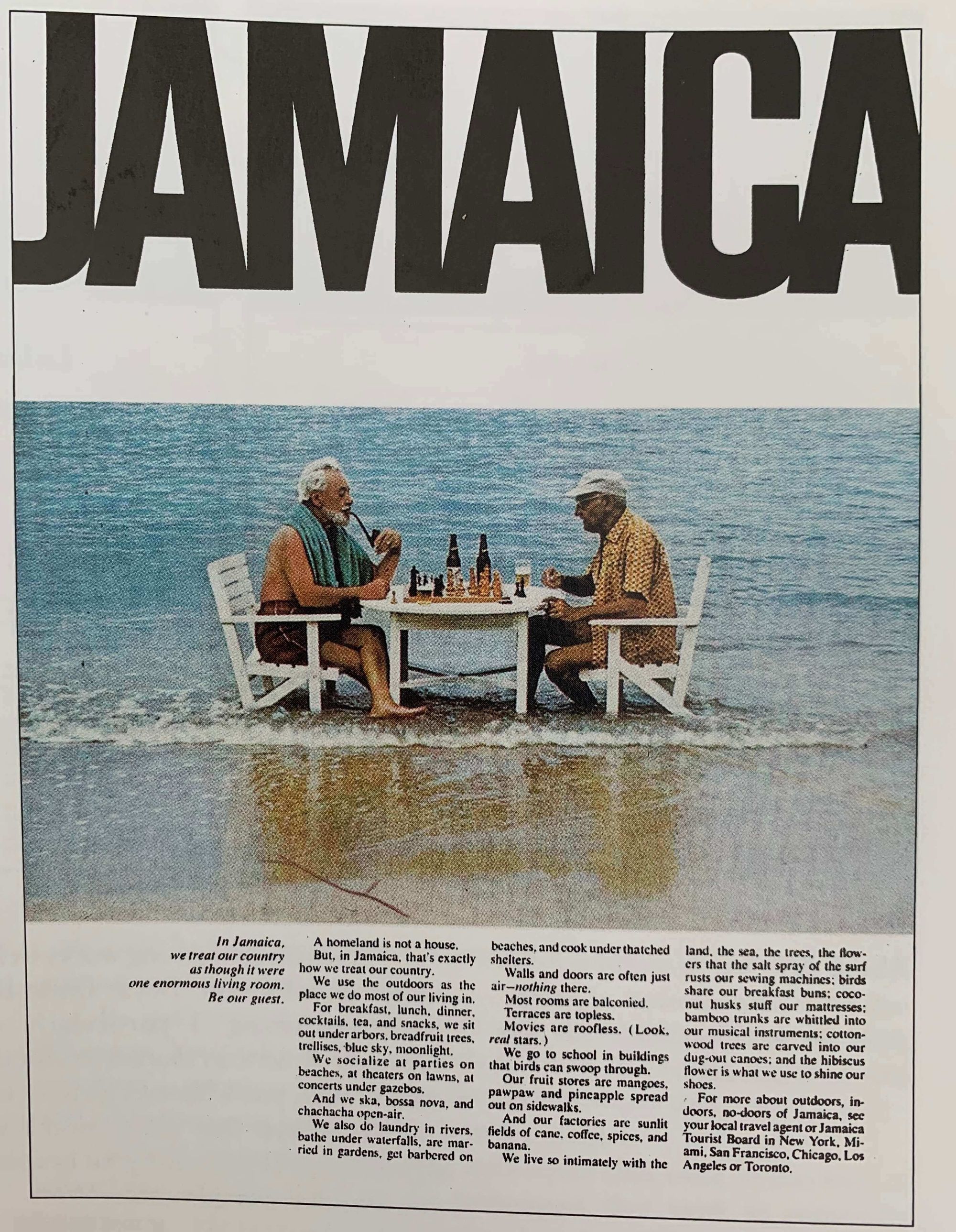
The most important factor in successful travel advertisement is the subject in the ad, they need to be unique and differentiated for people from other countries to make the trip to experience.
Reshape a corporate image by making the ad less self-serving.
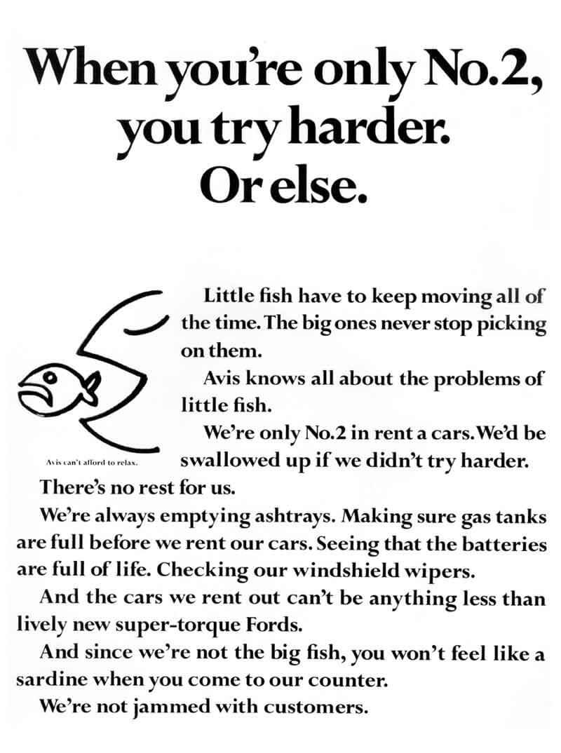
One of the most well-known ad that made Avis known, and Hertz miserable (the No.1).
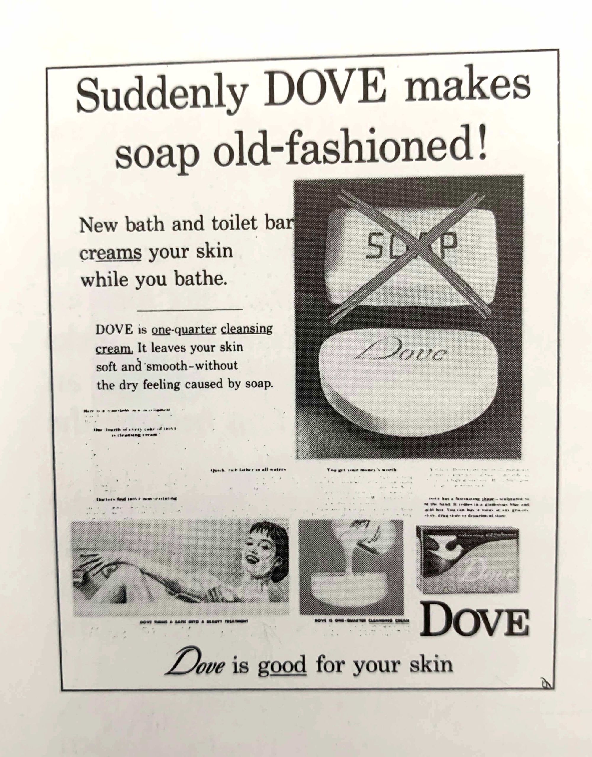
Dove was positioned as soap for women with dry skins, hence the famous line "Dove creams your skin while you bathe".
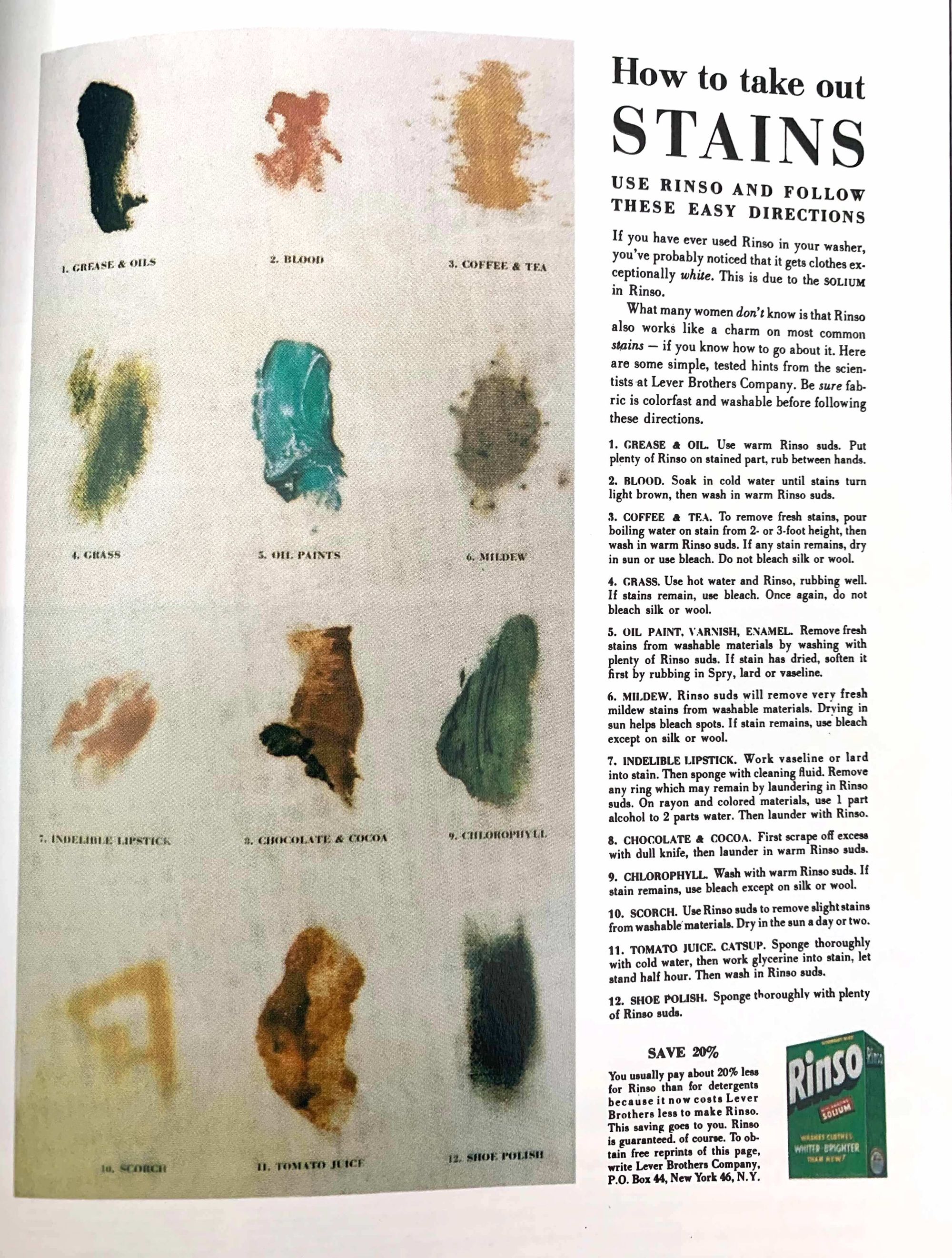
Instead of the common promise that 'Rinso washes whiter", Ogilvy created this Rinso ad showing how to get rid of different types of stains, much more helpful to customers compared to the former strategy.
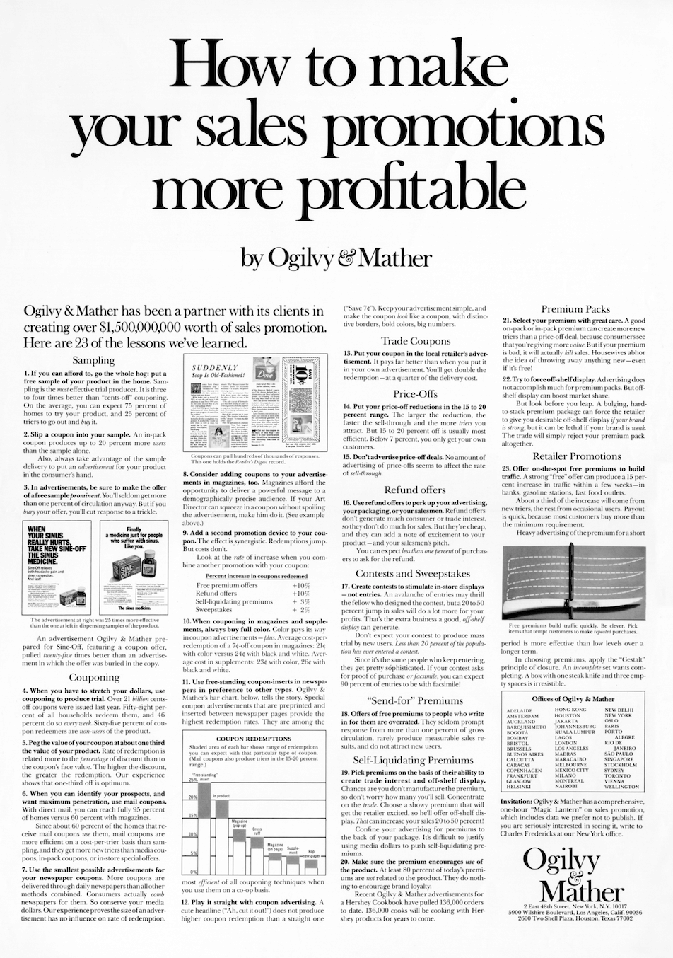
The origin of the give, give, take approach. Ogilvy created a series of ads to promote his agency by showing they know more about advertising. In his words, "my ads not only promised useful information, they provided it".
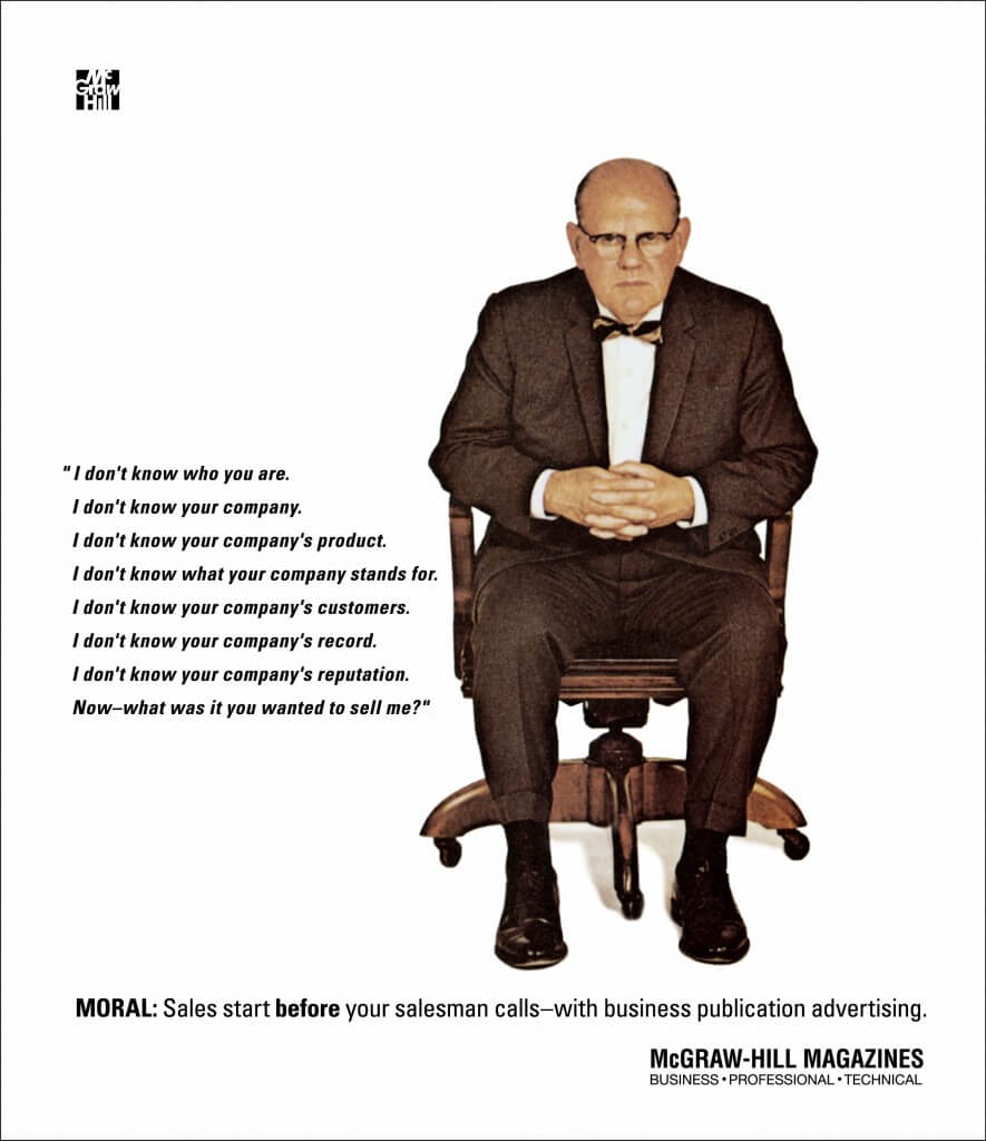
Many B2B companies can use this iconic ad as a template.
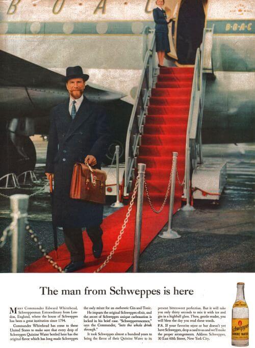
Ogilvy built Schweppe' brand image by using the founder of the company as the symbol consistently for 18 years.
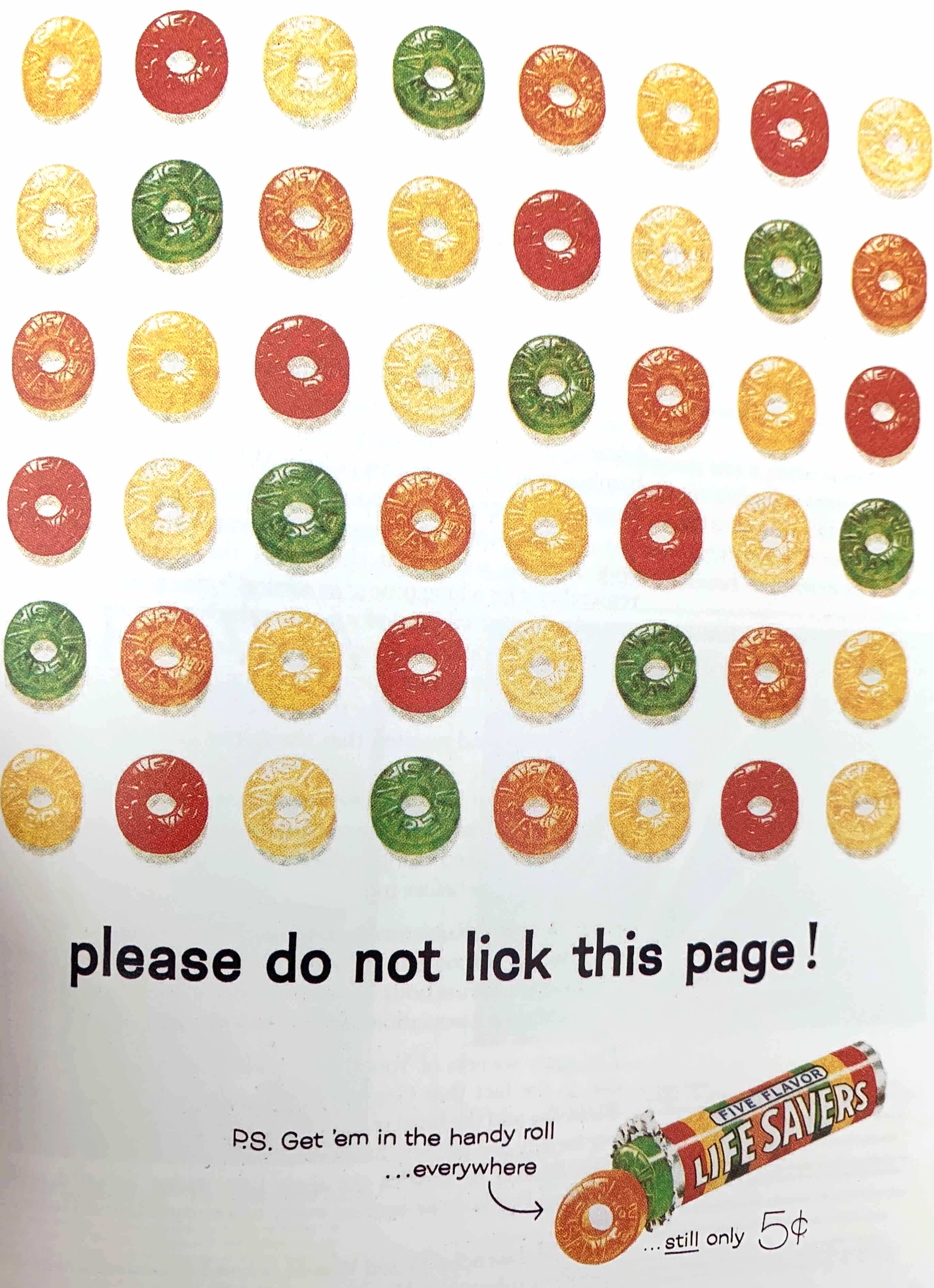
One of the best print ads by Raymond Rubicam.
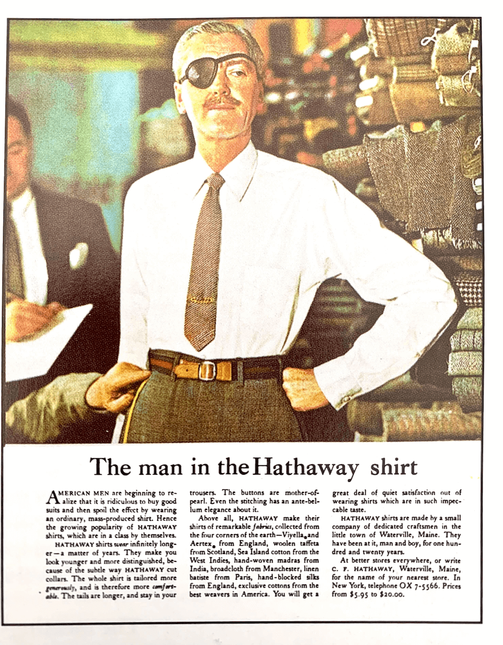
The man with the eyepatch for Hathaway shirts is an ad that made Ogilvy famous. The simple addition of the eyepatch elevated the ad from generic to eye-catching.
If you like this post, I recommend you give these books a read:
