How to Sell Beauty Online — Ecommerce Strategy of the Top Beauty Brands

The pandemic accelerated the digital transformation of many industries. But beauty brands have started selling products online long before last year. The skincare brand that caught even non-beauty buyers’ attention due to its recent Unilever acquisition, Paula’s Choice, has started using ecommerce and digital content to sell skincare products as early as 1995, a year after the first-ever secure online transaction.
Beauty is a category that should heavily rely on in-store try-on and beauty advisors’ guidance. The emergence of the new technology in the past decades, however, makes ecommerce not only a possibility but also a cost-effective sales channel for beauty brands. With the right strategy, you can bridge the gap between retail and online experience.
Those of you who followed me for a while know I learn through observations. So in this post, I collected some of the best ecommerce strategies from top DTC beauty brands for your inspiration.
The Basic — Site Speed
Beauty ecommerce sites tend to be image-heavy. Just like you wouldn’t let customers wait for a couple of seconds before showing the product in a retail store, you wouldn’t want the site speed to frustrate visitors and interfere with their online shopping experience.
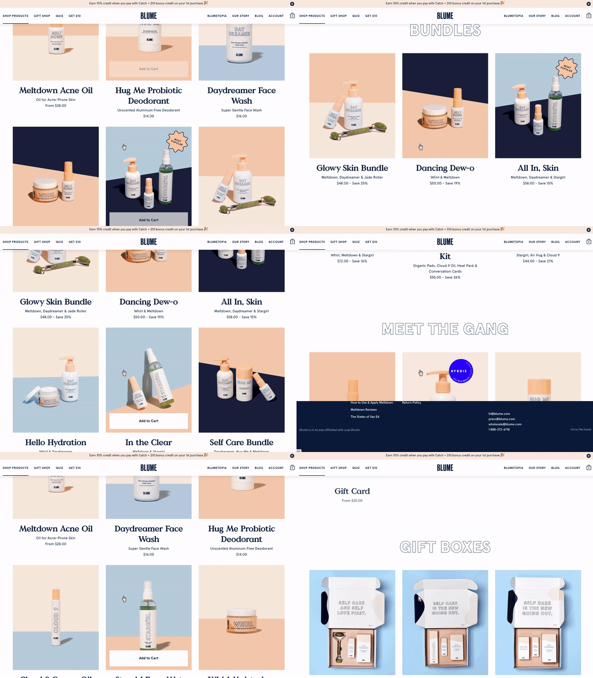
Example: Blume uses “load as you scroll” to load fewer images unless necessary.

DIY Bundling
It’s no secret that beauty brands use product/routine bundling (with discount) to increase AOV (average order value) and push less popular products. However, isn’t the likelihood of buying a bundle much higher if you let customers choose what’s in it?
Example: Hero cosmetics uses a custom bundle building tool to let customers DIY their own bundles and still snatch the discount.
Product in real life
Even with all the images and info, it’s hard for customers to envision what the products are like in real life shopping online, which adds more hesitation to clicking that checkout button. Some beauty brands have come up with innovative ways to overcome that.
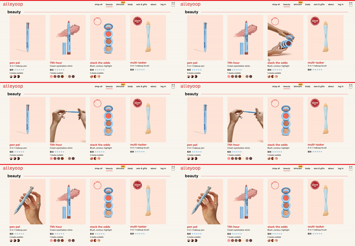
Example 1: alleyoop uses GIFs to showcase what is it like interacting with the products
Example 2: Soft Services lets customers use their mobile screens to visualize the actual size of the products.
Example 3: Glossier use community-generated photos to let people see the products in real life. Even better, you can shop the photos!
Reduce the friction of trying
The biggest advantage of having a retail presence is that customers can test out products, which is almost an essential step in buying beauty products, especially for makeup. For DTC brands, how do you reduce the friction of customer trying? How do you reduce the cost of returns and still give customers the confidence to order?
Example 1: To encourage people to try out their products, Kosas created a sampling kit that customers can buy for $35 and use the credit towards their next purchase. Genius!
Example 2: Fragrances are even more challenging to sell online compared to other beauty products. So Snif lets customers only pay when they keep the product.
Inclusive product information
Providing product information tailored to all kinds of customers is not just a PR stunt. It shows that you care about all of your customers by giving each one of them the info they need to buy from you.
Example: Glossier and Milk Makeup provides color/shade matching information for different skin tones.
Visual + Words
Without sales reps explaining to customers, your site needs to do all the talking. A picture is worth a thousand words. Use a combination of words and visuals to deliver your messaging most effectively.
Example 1: Keeps uses graphics + words to explain different kinds of baldness.
Example 2: Amika uses a before and after contrast photo to explain what “perk up” means.
Think like your customer
When people come to your site, some of them already have a product in mind, most of them have a problem in mind.
“I have a pimple I want to terminate”.
“My skin feels parched I need some hydration.”
Beauty can get really complicated and overwhelming with all the options and variations. Design the ecommerce experience through thinking like your customers and speaking their language.
Example 1: Topicals let customers select their skin state to browse products, which is more intuitive than using product category.
Example 2: Paula’s Choice uses everyday language to explain to customers what each ingredient in the product does.
Social proof… for real
Life is not picture-perfect. Social proof is most powerful when it’s real and relatable.
Example: Topical use real-life before and after photos to show the efficacy of their products.
Be upfront about shipping delays
Beauty products can be time-sensitive. Your customer might be waiting for a bottle of sunscreen to take to vacation, or they are running out of their makeup remover. Be upfront about shipping delays will save you much more customer service time and save you from losing (unhappy) customers.
Example: Supergoop uses a top banner to ensure that customers are aware of shipping delays, with details linked on another page.
Subscribe & Save
For everyday essentials, Amazon offers the option of one-time purchase as well as subscriptions at a discounted price. It’s a win-win, the business gets some predictable recurring revenue, the customer gets auto-delivery at a discount, what’s better than this?
Example: Star Face offers one-time purchase and subscription for customers to choose from. Surprisingly, this is rarely seen on DTC sites.
Cross-sell: highlight product combo
Beauty products from one brand usually work well used together with similar formulations. So don’t miss the opportunity to cross sell while you educate your customer on how to use a product.
Example: Drunk Elephant highlights how its products can be used together for different results.
Quiz…but with explanations
A recommender system is most compelling if it tells users the reasoning behind each recommendation. Remember how Netflix’s recommendation always starts with “because you watched xx…”
Example: Amika’s quiz result tells users why the products were selected based on their answers.
Parting words...Don’t do what you won’t do in retail. Do what you do in retail and better, because you can now.
